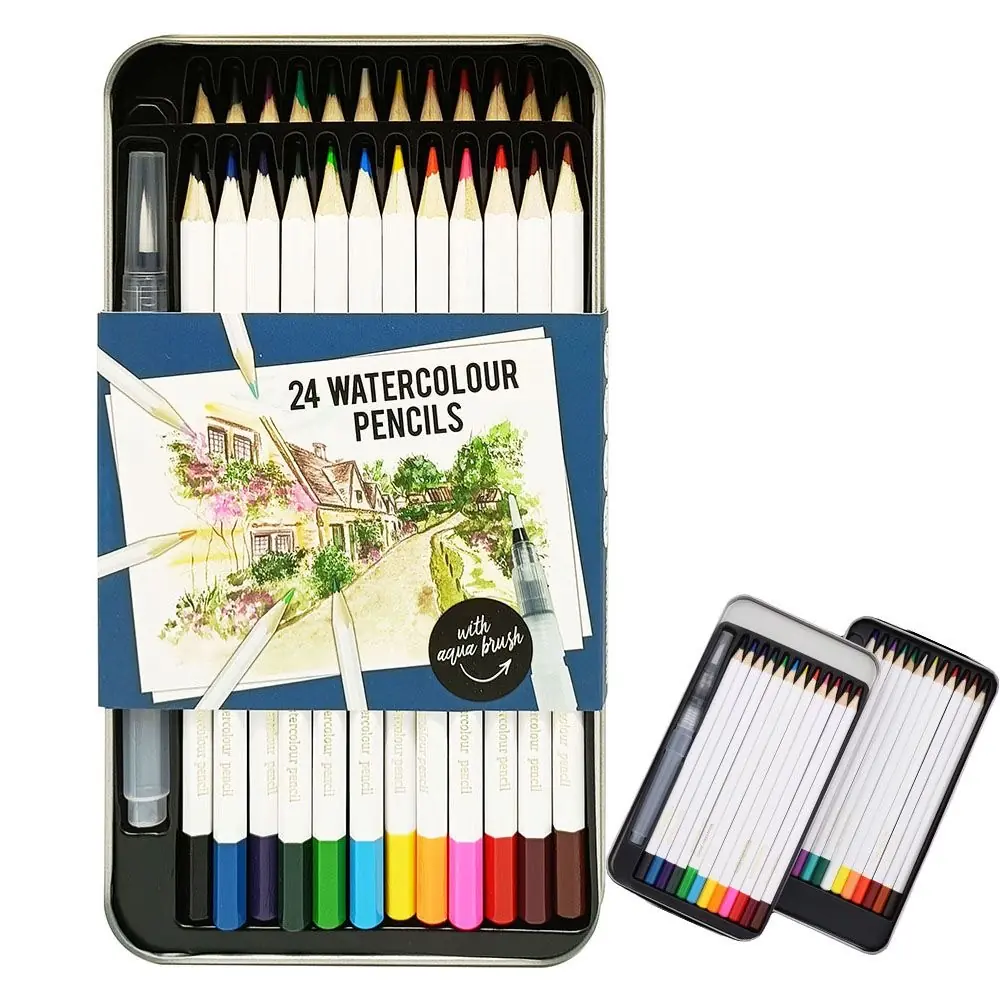
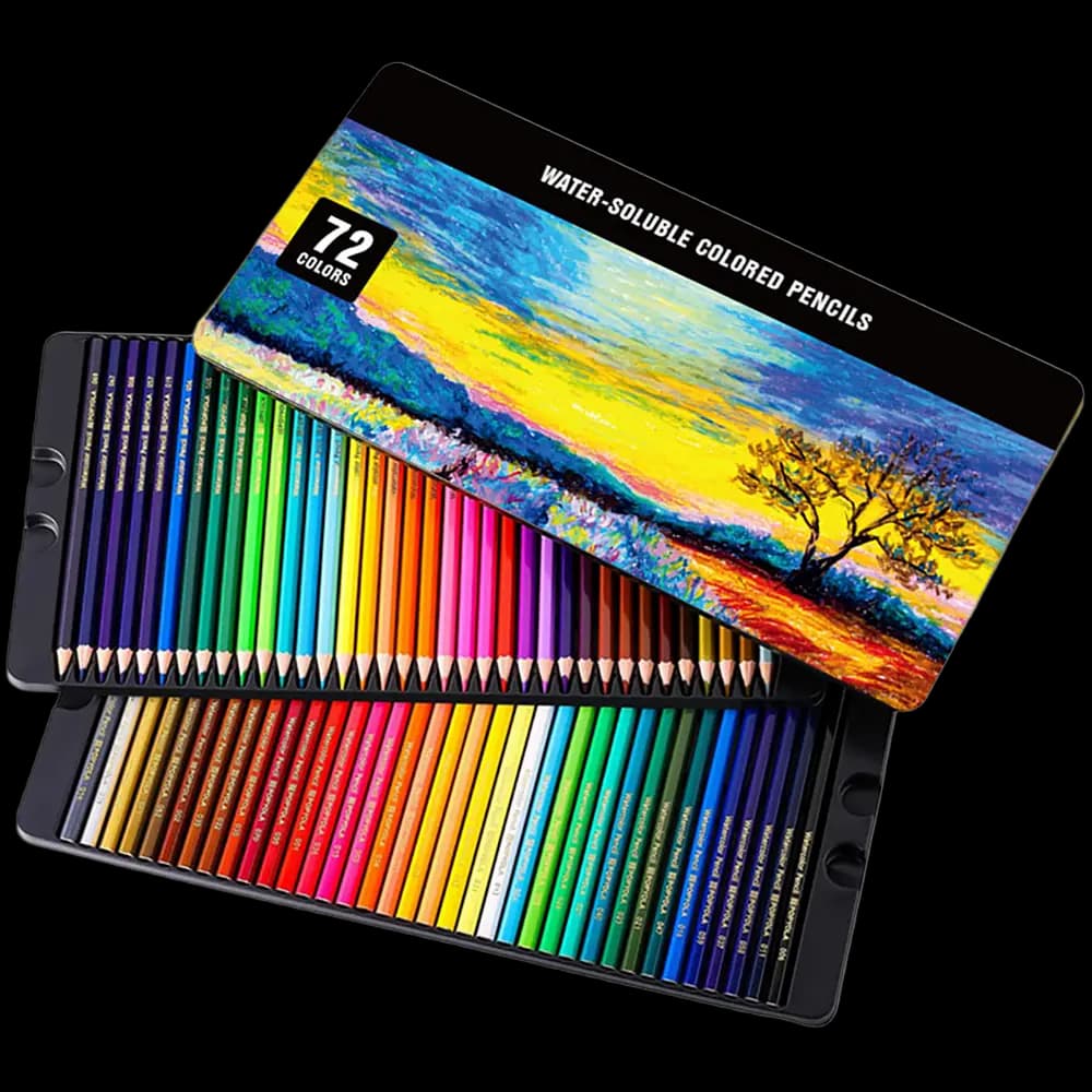
Watercolor pencils occupy a strange position in art supply: almost everyone stocks them, far fewer buyers can explain how to use watercolor pencils beyond "add water". That gap matters commercially. A set that demos well in the hand of a salesperson who understands technique sells itself; a set handed over with no technique story competes on price alone.
This watercolor pencil techniques guide is written from the manufacturing side. We produce water-soluble cores in twelve to seventy-two color sets every day, and the techniques below are the ones that show up repeatedly when artists and art teachers evaluate our watercolor pencil sets at trade fairs and in sample reviews.
How Watercolor Pencils Work: The Core Chemistry
A watercolor pencil is not a colored pencil that happens to dissolve. The core is a pigment-and-binder formulation in which the binder — typically a water-soluble gum or cellulose derivative rather than the wax or oil base of a standard colored pencil — is engineered to release pigment on contact with water. Dry, it lays down color like a firm colored pencil. Wet, the binder releases and the pigment disperses into a genuine wash.
Two manufacturing realities follow from that chemistry, and they explain most of the technique advice in this guide. First, pigment release is a design variable: cores formulated for strong release produce saturated washes but feel softer in dry use. Second, the core is more brittle than a wax-based core, which is why barrel quality around a water-soluble core matters more than around a standard colored pencil — sharpening exposes more core area, and any weakness in the wood shows up as a snapped tip. This is why our watercolor barrels use selected poplar, kiln-dried to 8–12% moisture, at a standard 175 mm length.
Dry First: The Dry-Then-Wet Workflow
The single most useful habit for watercolor pencil work — and the one most casual users never adopt — is to work dry first, wet second. Lay the drawing down entirely, or almost entirely, in dry color before any water touches the paper. The reasons are mechanical, not stylistic.
Dry strokes give you control that wet pigment takes away. Edges stay where you put them. Colors can be tested and corrected — a dry stroke lifts with an eraser; an activated one is permanent the moment it dries. Layering is predictable, because dry pigment applied over dry pigment sits on the surface, while pigment applied over a damp layer bleeds downward into it. And the pencil itself rewards the approach: a 3.8 mm core sharpens to a point that holds through detailed dry work, then floods into a wash when you choose to activate it.
The workflow in practice: block in the largest shapes with the side of the pencil, build mid-tones with controlled pressure, reserve the lightest areas by simply leaving them bare or shading them with white, and only then activate with a damp — not dripping — brush. Work from light washes toward dark ones, because the reverse direction is not available to you: once a dark area is activated and dried, lifting it back to light range is barely possible.
For buyers evaluating sets at a sample stage, the dry-first test is the most revealing one. Make a dry gradient swatch of six adjacent colors on cold-press paper, activate half of it, and let it dry. Cores with consistent formulation show even transitions across both halves; inconsistent batches show streaking or patchy release that no technique can rescue.
Going Wet: Washes, Gradients, and Wet-on-Wet
Activation technique determines whether a watercolor pencil set performs like paint or like a smudged colored pencil. Three variables do most of the work: water volume, brush load, and paper wetness.
For a flat wash, activate pigment deliberately rather than dragging a wet brush over dry strokes and hoping. Scrub a loaded patch of dry color on scrap paper or a palette area until you have a puddle of dispersed pigment, then carry that to the paper with a flat wash brush. The result is an even field instead of streaks following your pencil strokes. For gradients, work the wet edge before it dries — lay saturated color at one end, clean water at the other, and let the damp boundary blend itself. Watercolor pencil pigment disperses readily but is not patient: a dried edge will not accept a second blend attempt the way tube watercolor will re-wet.
Wet-on-wet is the technique that produces the effects watercolor is famous for — soft clouds, mist, and atmospheric skies. Wet the paper with clean water first, then touch dry pencil tips, or shavings, or a pre-mixed puddle into the damp surface. The pigment blooms outward on its own. This is where the medium genuinely outperforms what most people expect from a pencil: a 72-color set in the hands of someone who works wet-on-wet produces gallery-grade skies. For mist and fog specifically, the sequence professional artists reach for is a pale wet-on-wet base, dried completely, then a second wet pass restricted to the deepest shadow areas — two patient layers beat one heavy one.
One caution that belongs in every watercolor pencil tutorial aimed at retail staff: over-brushing. Once pigment is activated, every additional pass degrades the binder and re-dissolves settled pigment, producing muddy color and pilled paper. Two passes, three at most, then stop.
Glazing: Building Depth Without Mud
Glazing is layering at its most disciplined: apply a wash, let it dry completely, then apply a second transparent wash over it. The layers mix optically in the viewer's eye rather than physically on the paper, which preserves a luminosity that physical mixing destroys.
Watercolor pencils are unusually well suited to glazing because each layer can start as dry pencil — precise, controllable, correctable — and only the activation step commits it. The working rhythm is: dry layer, activate, dry fully, dry layer again, activate again. The drying pauses are not optional. Glazing over a damp layer is how you get mud, because the second application re-dissolves and physically stirs the first.
Color logic makes or breaks a glaze. Layer transparent colors over one another — a cool blue glaze over a warm yellow underlayer reads as luminous green in a way a mixed-on-palette green rarely does. Opaque or heavily pigmented colors used as upper glazes sit on the surface and scatter light flatly; reserve them for the first layer or for dry-finishing touches. Testing glaze combinations on a swatch card before committing them to a piece is a thirty-second habit that separates controlled work from frustration.
White Highlights and Reserved Light
The brightest white any watercolor piece can contain is the paper itself, which is why planning lights comes first in classical watercolor practice. But watercolor pencils add an option plain watercolor lacks: a white watercolor pencil used dry.
A dry white core applied over finished, fully dried work lays down a layer that partially resists and partially covers — the effect reads as a sparkling highlight rather than a painted correction. It is the standard technique for glass, metal, and water surfaces: catchlights on a wine glass, the glint on chrome, the broken light on a river surface. Used on textured cold-press paper, the white catches only the tooth of the surface, which is exactly the broken-sparkle quality these subjects need.
Order matters, and it is the opposite of what beginners assume: white goes on last, dry, over fully dried work. Applying white early and washing over it produces a waxy resist patch that repels later pigment unevenly — sometimes exploited deliberately as a technique, but unreliable for highlights you care about. Reserve the paper for planned highlights you can protect, and keep a dry white pencil for the unplanned sparkle you decide on at the end. Every set format we ship that includes a white is specified on the assumption it will be used dry at the finishing stage.
Choosing Paper for Watercolor Pencils
Because the medium starts dry, many users assume any sketchpaper will do, then blame the pencils when washes cockle and colors dry flat. The paper decision is simple once it is framed by technique. Dry-dominant work with light activation — illustrating, journaling, adult coloring — is happy on a 200 gsm mixed-media sheet. Wash-heavy work, glazing sequences, and wet-on-wet need 300 gsm and cotton content, and benefit from being taped or clamped at the edges while working.
Texture is a technique decision, not an aesthetic one. Cold-press (rough) paper granulates pigment into the valleys of the tooth, which flatters washes and gives dry white highlights their sparkle. Hot-press (smooth) paper takes clean dry lines and even flat washes but shows every brushstroke and dries faster — a double-edged property for gradient work. For retail demonstration purposes, cold-press is the safer default: it forgives uneven activation and produces the most impressive wet-on-wet blooms.
From Technique to Specification: Writing the Spec Behind the Demo
For art-supply buyers, technique knowledge converts directly into purchase specification. When you evaluate watercolor pencil sets for a program, the demo table tells you what the product can do; the specification sheet tells you whether it will still do it at production scale. Four checkpoints translate the techniques above into spec language:
- Wash performance → core formulation: state the expected wash saturation in sample terms (a standard activation swatch you approve as the gold sample), not adjectives. Cores vary between production batches like any pigment formulation; anchor the expectation to an approved physical sample.
- Dry-detail performance → core diameter and hardness: 3.8 mm professional cores balance wash strength against dry-point retention; 3.5 mm school-tier cores favor durability and cost. Match the spec to the tier you are buying.
- Sharpening integrity → barrel material and moisture: water-soluble cores snap in barrels dried below spec. Selected poplar kiln-dried to 8–12% moisture is the engineering answer; a supplier who cannot quote a moisture range is quoting price, not process.
- Retail compliance → documentation: EN71-3 heavy-metal compliance and REACH SVHC testing are baseline for sets sold to children and students; FSC chain-of-custody documentation for the barrel wood is baseline for European retail programs. All three should arrive as documents, not promises.
These are the same checkpoints we build our own watercolor pencil range around, across 12-color school sets through 72-color professional tins. For programs that need bespoke palettes, custom counts, or private-label packaging, the specification conversation starts at our custom pencil OEM service — request a quote and sample evaluation, and test the techniques above on your own gold sample before committing to production.
Putting It Together
The complete working sequence that ties these techniques together: plan lights and reserve them; block in dry, light to dark; activate deliberately with controlled water; dry fully between layers; glaze transparent colors for depth; finish with dry white for sparkle. Every step rewards a core that was formulated, centered, and housed properly — which is why technique guides and specification sheets belong in the same conversation. For a broader sourcing view of the colored and watercolor pencil category for European retail programs, read our colored pencils sourcing guide, or see how the manufacturing side operates in our Qingyuan pencil factory overview.